These days we use technology for everything. From managing our money to ordering necessities. It’s a vital part of life. So why are so many people unable to access it? Globally, over 15% of the population has a disability. Yet still many popular websites and apps are inaccessible.
Many of our favorite tech features stem from accessibility. This includes voice control, captions, and clear content. Accessibility benefits everyone, including your business. It builds trust, heightens UX, and attracts a wider customer base. Lack of accessibility can also give your business a bad rep and cause financial losses. All in all, accessibility is well worth your time.
Talking about making your site accessible is one thing. But how do we actually put this into practice? That’s where we come in. We’ve created a series of lists containing different accessibility suggestions. These are grouped by the type of disability that they’re tailored towards.
Provide Alt-Text
It’s been said a million times. It seems like adding alt-text is the number one accessibility suggestion. It’s impossible to escape. But yes, it really is that important!
Alt-text (AKA alternative text) is a short text description of an image. This is given when a digital platform fails to load. More commonly, it’s used by people with visual impairments.
Globally, 253 million people have vision impairment. Many of these individuals rely on screen readers. Although these are great for text content, screen readers are unable to interpret images. They rely on alt-text to convey what an image is and its purpose. Alt-text gives people essential context when browsing.
All major digital platforms should support alt-text. But if you are unable to add it, then you can add a short text description below an image instead. Keep the description brief but be sure to include all the important details.
- Bad example of alt-text: Cat
- A better example of alt-text: Tabby cat in a blue rucksack.
If an image provides no additional information at all, then it can be considered decorative. Decorative images have no purpose so they don’t need alt-text. However, they still need to have an empty ALT attribute so the screen reader knows to skip over it. This ensures that the screen reader works properly.
Important Information First
Reading a full text takes a lot of time and energy. This is much worse on screen readers - even at double speed. So it’s our responsibility to put all important information first. This decreases the chance of people missing out on vital info.
The best way to do this is by using the inverted pyramid method. This means we put essential information first. Then, we add important information. Last, we include information that’s nice to know.
Essential information includes:
- Who?
- What?
- Where?
- When?
- How?
It’s a good idea to start with a table of contents if your article is very long. They make info much easier to find and save a lot of time, especially for people using screen readers.
Use Color Carefully
Color blindness is when someone has difficulty seeing or differentiating colors. Around 300 million people worldwide are color blind. Yet color doesn’t always get the accessibility attention it deserves. Poor use of it can quickly make content inaccessible. Avoid this with these simple rules.
Use strong contrasting colors. WCAG guidelines state you should have a text-to-background contrast ratio of at least 4.5:1. Many people choose a white background with black text to achieve this. However, the intensity of this can be difficult to read and causes eye strain. It’s also not a dyslexia-friendly color combo. Many people with dyslexia prefer reading dark text on a pastel background. If you still want a black-and-white theme, use an off-white and a grey-black instead. This increases text clarity and boosts reading stamina.
Always avoid color combinations such as red and green or blue and yellow. These are difficult to read and cause endless problems for people with color blindness. If you are unsure about your color choices, then put everything in greyscale. Change anything with poor visibility or contrast.
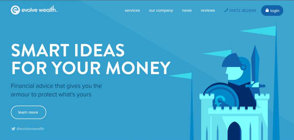
Consider using a monochromatic color palette. This means your content is in different shades of one color. It’s striking and can be great for people with color blindness. But be sure that there’s an obvious difference between each shade.
A great example of using a monochromatic palette is the Evolve Wealth website:
Screen Reader Compatibility
Screen reader compatibility should always be a top accessibility consideration. Ask yourself these questions. Are all aspects of my website accessible from only a keyboard? Is everything on my site labeled properly? Do I have clear headings? If you have answered no to any of these, then your site is not screen reader compatible. Changes need to be made.
For screen readers, you also need to indicate which language the text is written in using the HTML lang attribute.
Spellings crossover in different languages but have different meanings and pronunciations. The screen reader needs
to know which language it should be voicing.
For example, this page uses <html lang='en'> with ’en’ standing for English. If I were then to use the Spanish word ‘hola’, I would need to input:
<span lang='es'>hola</span>
This lets the screen reader know I am now writing in Spanish (es = Español). Without this, the screen reader is likely to mispronounce and misinterpret the word which causes confusion.
Use Headings
Most people are only interested in certain information on a website. Headings let people skim through content to find what they need efficiently.
Even sped up, it takes a long time for a screen reader to go through an entire webpage. That’s why screen readers can focus on different elements depending on which keys you push. When you press H/shift+h, the screen reader only focuses on heading elements. A good heading will describe exactly what the paragraph is about in as few words as possible. Accurate headings save screen reader users a lot of time and hassle.
Label Content Well
You would never buy a tin with an unclear label like ‘food’ or ‘meat’ during your weekly shop. So why do web developers think users will click on links with vague labels?
‘Click here’ and ‘more’ are link phrases that are still common on web pages. These descriptions are unhelpful. Plus, they’re a downright nightmare for people using screen readers. You must label all content with a text description. This should accurately tell you what the control does or where it takes you.
Never use a graphic or symbol alone to label what an interactive element does. Screen readers cannot interpret these. You must give an additional text description. For screen reader users, a symbol alone is as useless as nothing at all.
Predictable Layout
Accessibility demands predictability. It’s a WCAG guideline.
Predictability means that components are in a familiar spot and they work as expected. People that use screen readers are used to certain web layouts. This is what they base their navigation off. Straying from this makes it more difficult for them to use your website. In fact, it makes it more difficult for everyone to navigate your site.
Putting things in a familiar place is good business practice. People like what they’re used to. You’re likely to get fewer complaints and questions if it’s easy for people to find what they need.
Good Quality Audio
Many people with vision impairment rely on their other senses to navigate life. They often use their hearing to access digital content independently. Therefore, the audio on your digital content must be as clear as possible.
Make sure of the following things. One, the audio is loud enough. Two, you do not have any crackles or faults within your audio. Three, there is no distracting music or sounds in the background. WCAG guidelines state the speaker’s voice should be 20 DB louder than any background audio.
Always remember to provide a transcript or text alternative to any audio content. Some people may have audio-processing problems. Or they may simply want to consume their content differently. Choice is at the core of all successful digital accessibility practices.
Never Use Color Indicators Alone
As mentioned before, people forget how inaccessible color can be. This is why so much content relies on color indicators. But for many people with color blindness, these indicate nothing.
Never use color alone to convey something. Always provide additional text and symbols to show what color changes mean. For example, a box may flag red if you enter incorrect information. But you may not recognize this change if you’re color blind. Adding text and symbols into the mix leaves less room for confusion.
It may seem difficult to express your meaning without color when making graphics. However, color is always an addition. Not a necessity. If you’re making a chart, differentiate data using simple patterns and textures instead.
Avoid PDFs
Only use PDFs for content that needs to be printed.
The main problem with PDFs is they lack navigation. Content guides at the start provide a false sense of navigation. However, these are often faulty and unhelpful. This is a huge problem for screen reader users.
PDFs are also usually heavy on content and text. They try to compress as much into a page as possible due to sizing restrictions. This results in a lack of whitespace, which allows us to perceive and read content more easily. This can cause eye strain and confusion.
There are some ways to make PDFs more accessible if they’re unavoidable. Make sure that the PDF is searchable. Use a clear font that has a good contrast to its background. Never use color alone to signify something. Lastly, make sure to label all sections clearly.
No Auto-play Feature
Never set video components to auto-play.
Screen readers read components aloud to let users navigate a page. They rely entirely on sound. Auto-play disrupts navigation which can be distressing and confusing, especially because it can be so difficult to turn off.
On top of this, it’s annoying. It often interrupts music or podcasts which no one enjoys. Audio and video components should only play when activated.
Use Whitespace
A lot of people argue that you need to make the most of a space. Actually, the opposite is true for accessible design. Empty space is a good thing.
Whitespace is all the empty space around content and text. It gives your platform a modern look. Plus, it helps us to consume content. It breaks up large sections of text which makes content easier to read and zoom in on. This helps to reduce eyestrain and visual difficulties.
Make sure to take a break every so often. Everyone will thank you for it.